Effective Websites for Solopreneurs,
Small Businesses, and Non-Profits
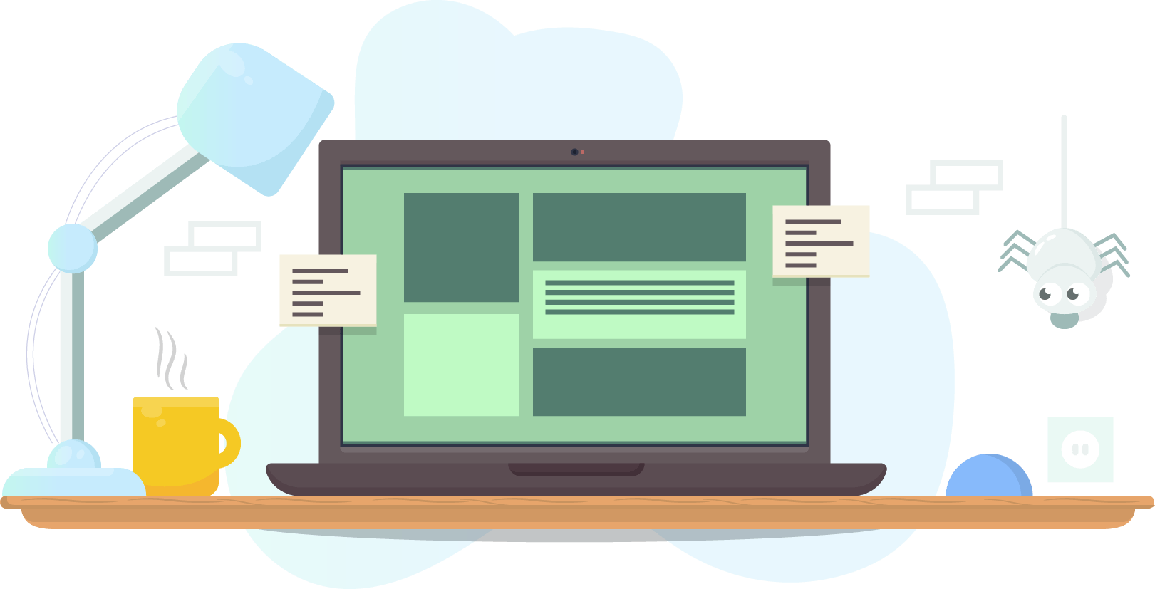
Professional websites, easy to update, on premium cloud hosting, and still affordable!

Graphics Design: Logos,
Business Cards, and More
You never get a second chance to make a first impression! Make your first impression your best impression.
Don't Hide What You Offer!
Get Found Online!
Yes, you are getting checked out online by potential clients, even if they were given a personal referral.
It's not the 1980's anymore!
We love what we do! Let us do it for you!

Kim
Partner,
Artsy Elf
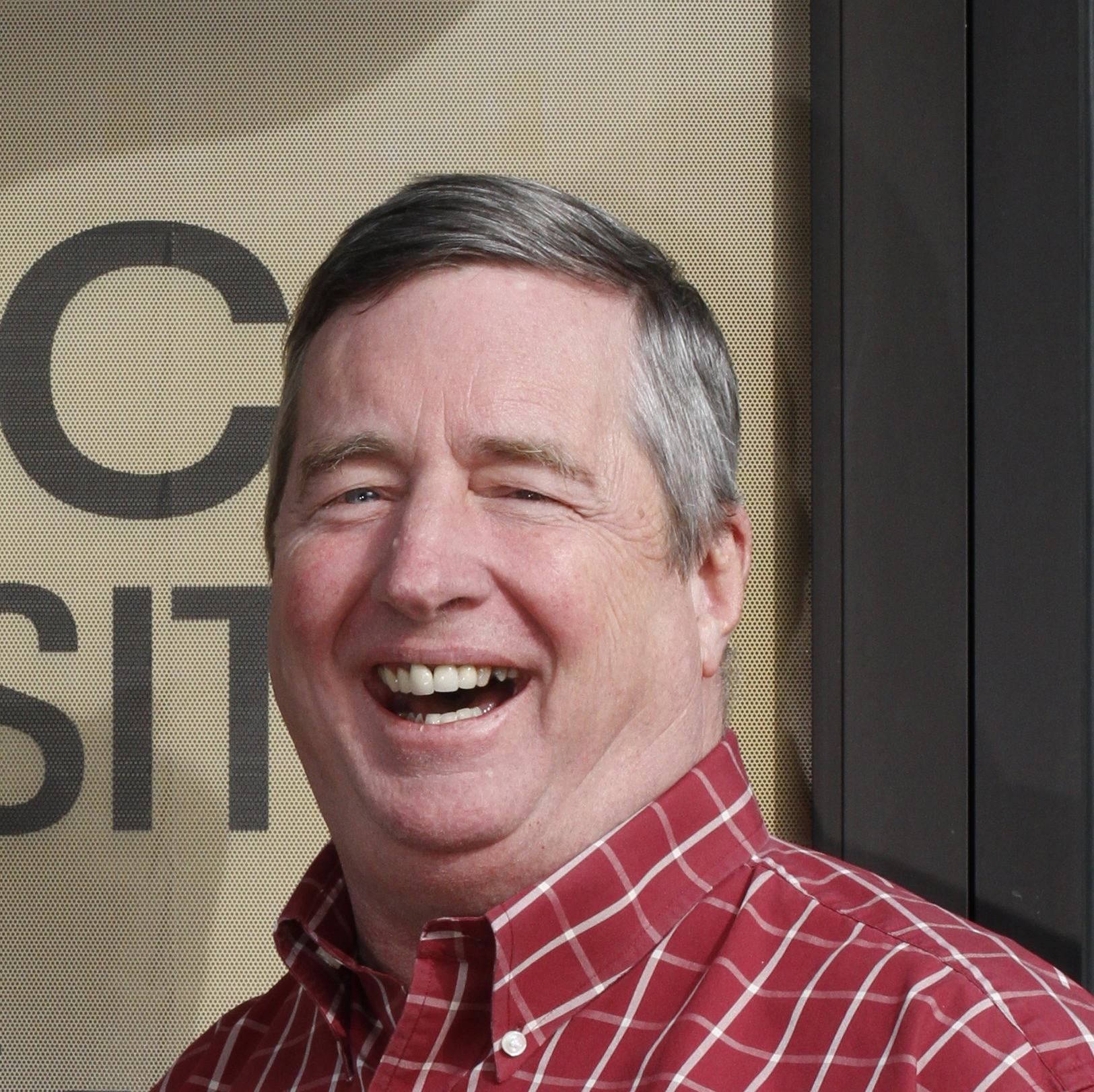
Bill
Partner,
Resident Geek

Margie
Windows Geek
and Email Fixer
A few of those we've helped over the years...


Our Latest Blog Posts
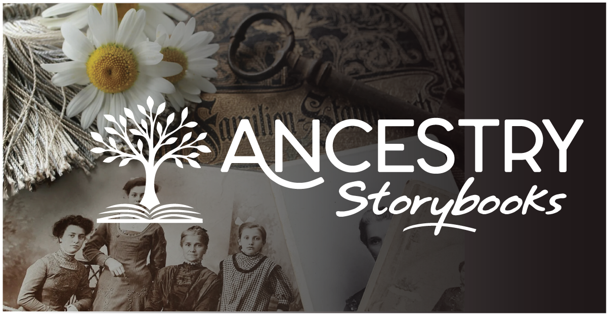
Some businesses are built to scale fast. Others are built to last. Ancestry Storybooks falls firmly into the second category. This is a service dedicated to preserving family histories by transforming memories, photographs, letters, and heirlooms into beautifully designed, custom-printed storybooks. These books aren’t trends or novelty gifts. They’re keepsakes meant to be shared, revisited, and passed down. When we partnered with Ancestry Storybooks, our goal was simple: create a logo and website design that reflected the depth, care, and professionalism behind the service.
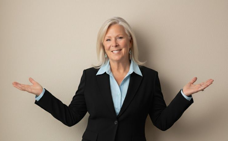
A Central Oregon Real Estate Case Study Starting over is hard. Starting over in a new market with zero local connections ? That’s brutal. This is the story of a realtor who did exactly that, and how a focused digital foundation helped turn decades of experience into real, measurable momentum.
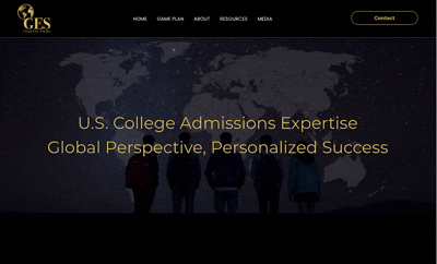
We’re excited to unveil the new digital home for Global Elite Scholars , an international consulting firm built on strategy, expertise, and a proven record of helping students succeed across borders. But this project was far more than screen-level design. It was a team effort, their vision, paired with our strategy, experience, and understanding of what works globally and locally for a diverse audience. Creating a website that speaks to families around the world meant aligning:

