Some of our Favorite Blog Posts
Check out a few of our favorites from over the years, then

Short Story Marketing helped create the brand identity, logo, and landing page for Poppy, a women’s retreat for women 50+ in Rancho Santa Fe, California.

AI tools use your website, listings, reviews, and directories to recommend businesses. Here’s what to update so your business is easier to find and trust.
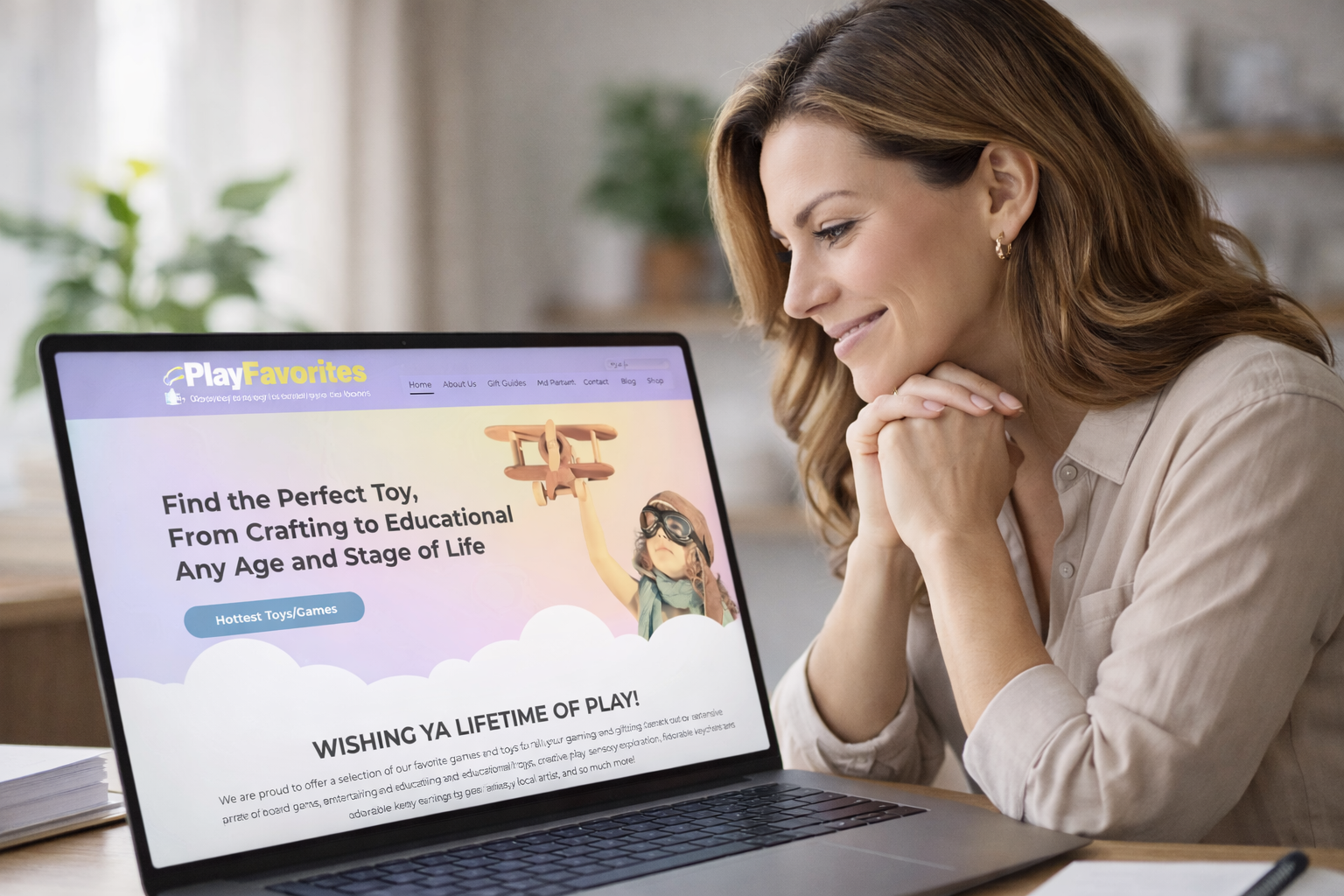
We built a trust-based website for a toy store. Same framework we use for therapists and financial advisors. Here's why it worked — and why it always does.
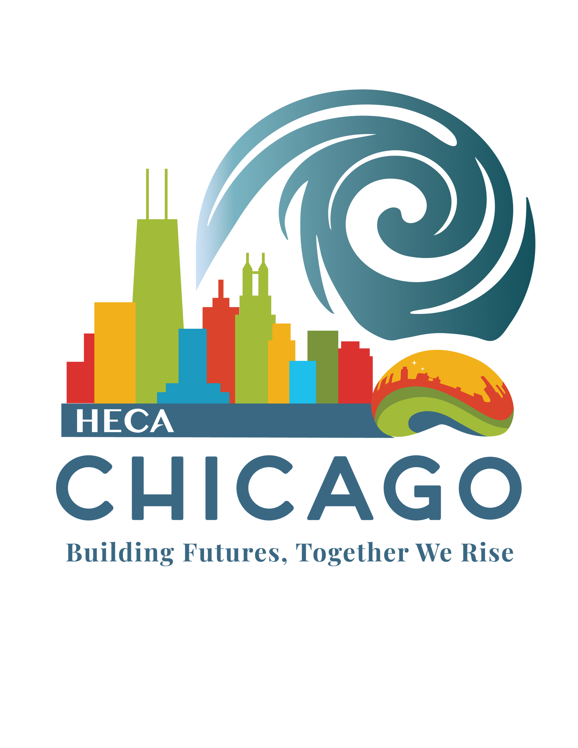
From brainstorm to branding board — see how SSM created a full visual identity for the HECA 2026 Conference, inspired by Chicago's architecture and energy.

A Facebook post reaches half its audience in just 76 minutes. A blog post lasts two years. Learn how to combine both for a smarter content strategy.

Research by Dr. Jill Larkin at Carnegie Mellon shows experts think differently. Here is why hiring a marketer with experience in your field saves small businesses time and money.
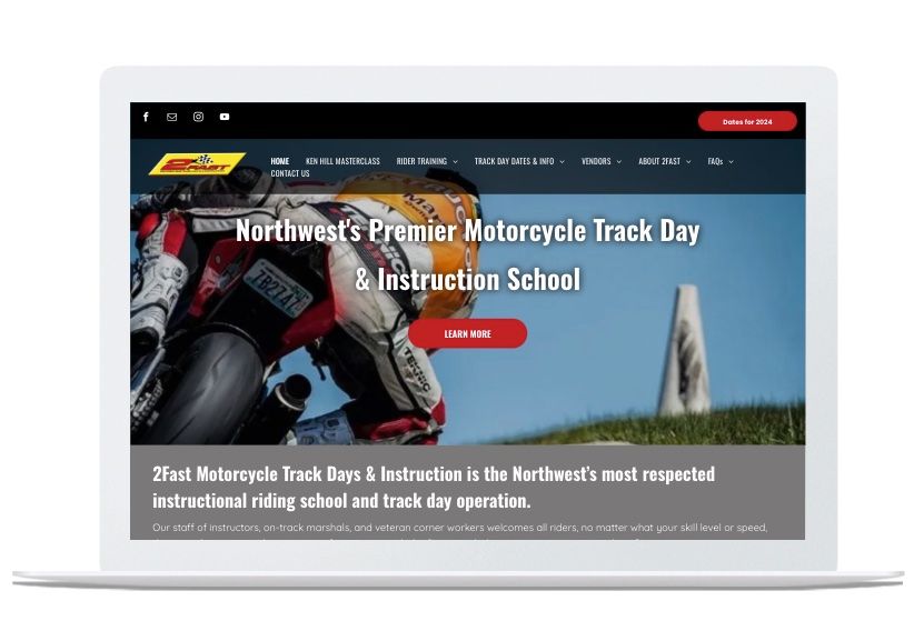
2Fast.org needed a website as dynamic as the community behind it. Here's how we redesigned the Pacific Northwest's top motorcycle track day organization.
People still scan websites before they read. Learn what newer NN/g research says about online reading behavior and what it means for your small business website.

Technology evolves, expectations shift, and competitors refresh. Here are 5 signs your website is overdue for an update — and why it's costing you business.

Sell on benefits, not features — it's Sales 101. Here's how to apply that to your homepage so visitors immediately see how you solve their specific problem.

Your referral just Googled you. What did they find? Research shows 91% of people check a business online before reaching out — even when a friend sent them.

