The Short Story
Tips and Tricks and Useful Info
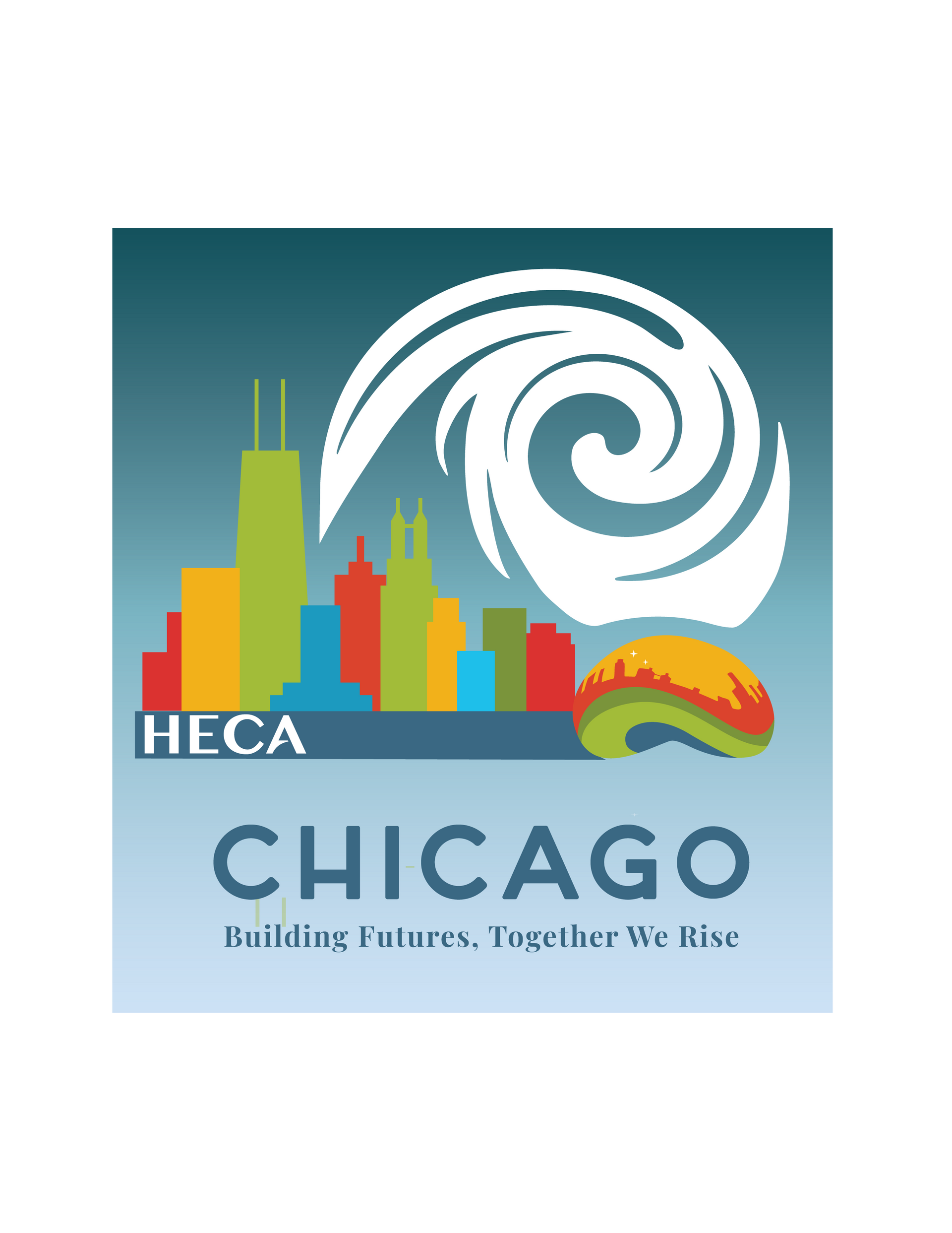
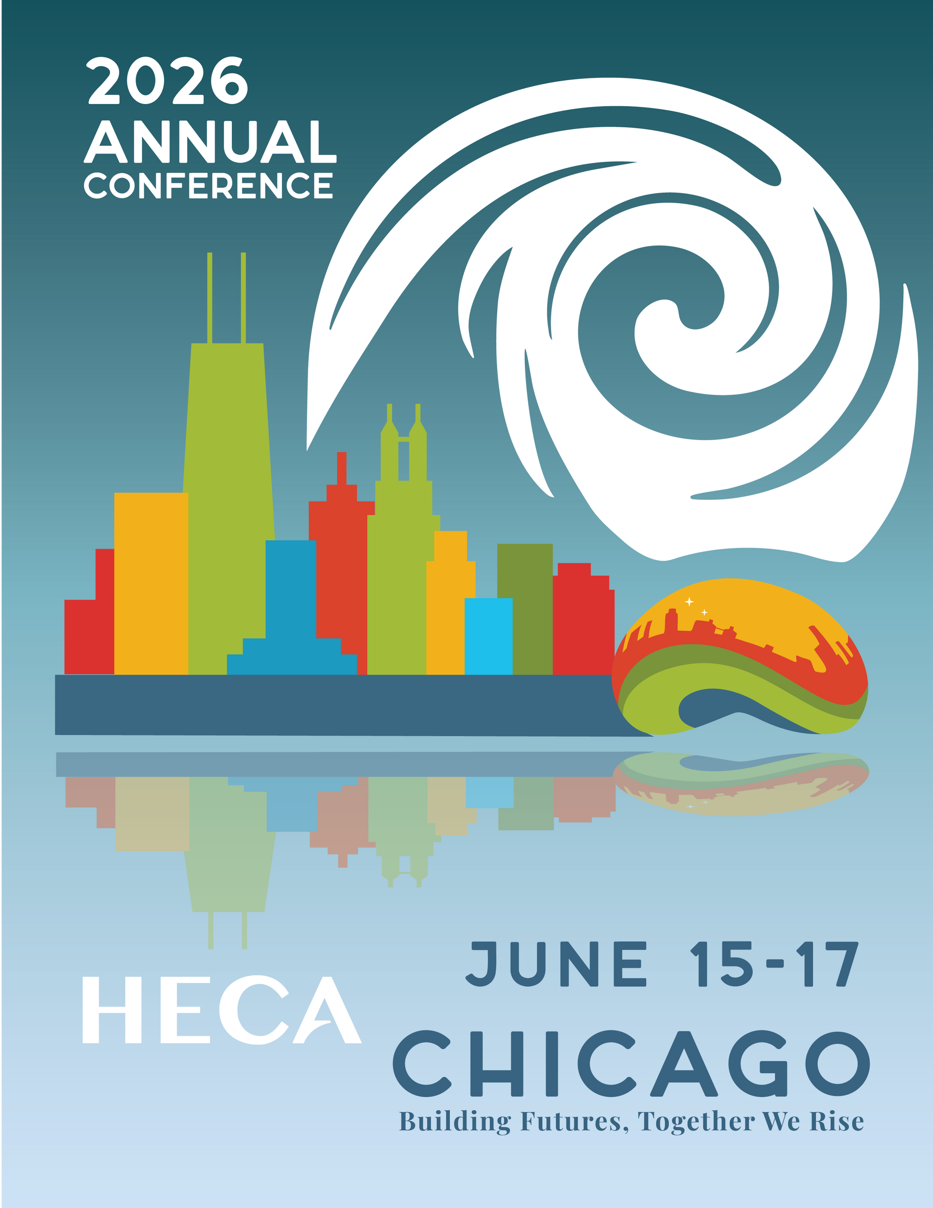
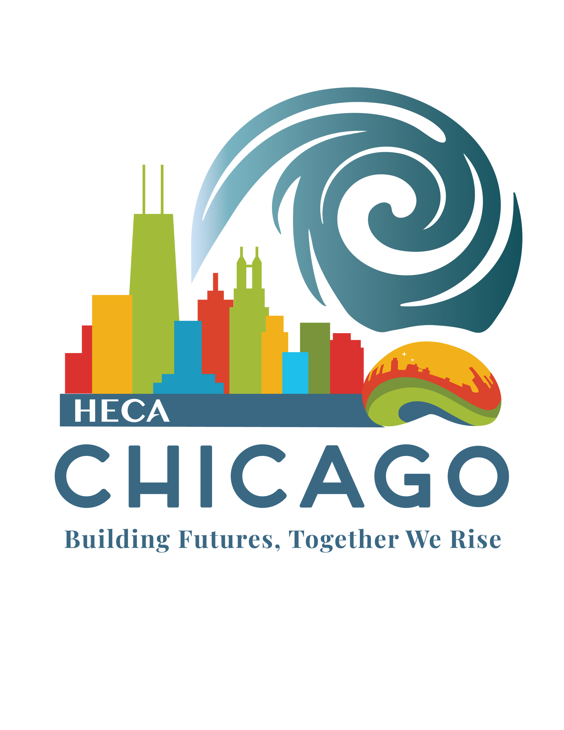
Designing the Future: Behind the Visual Identity of HECA 2026
When HECA reached out about designing the branding for their 2026 Conference, it felt like a rare kind of opportunity. Not many organizations turn to their own network of members and partners for a project like this—and it meant a lot to be trusted with the creative direction.
Working with their team and board leaders, we explored how to visually express the energy and setting of the upcoming conference. The city of Chicago—and its architecture, history, and visual rhythm—became a big source of inspiration.
As a designer, I dove into that vibe and came back with a wide range of concepts: logo directions, taglines, visual themes. After rounds of feedback and refining, we landed on a fun exciting concept that captured both the spirit of the location and the message HECA wanted to share.
The result? A full brand identity that’s bold, flexible, and built to connect—with a clear nod to the city that’s hosting it all.
The final theme—“Building Futures, Together We Rise”—was inspired by the spirit of Chicago. Known for its rich history, iconic architecture, and fun energy, Chicago also brings a unique vibe we wanted to capture. They had a specific color palette in mind but gave us freedom with fonts and illustrations. As someone who once called the Windy City home, I knew we had to weave in a nod to that famous nickname.
Designing a brand is always a bit of a balancing act—too many elements can crowd the message. So the challenge was blending all these pieces into something that felt unified and meaningful. We kicked things off with a good old-fashioned brainstorming session to figure out the overall look, and the perfect tagline ended up being the “icing on the cake.”
That logo/overall theme become our anchor, shaping every visual choice from start to finish. It helped us nail down the mood of the colors, the rhythm of the type, and the deeper meaning built into the logo. Every detail was guided by that core message.
What we built includes:
· A flexible theme lockup that works across formats
· A color system that feels both vibrant and grounded
· Custom icons and social-ready graphics
· A bold hero poster to set the tone for the conference
· Then package the entire branding board; files and let HECA continue to move forward with their launch for the 2026 Conference.
I’ll be sharing more behind-the-scenes visuals and design process soon—but for now, it’s just exciting to see it out in the world, supporting a conference that brings so many voices together.