The Short Story
Tips and Tricks and Useful Info
The Tillamook Bay Watershed Council
Bringing Fresh Flow to a Community Icon: The Tillamook Bay Watershed Council Rebrand
When an organization like the Tillamook Bay Watershed Council (TBWC) looks to the future, it helps to start with a brand identity—one that reflects the land, rivers, and spirit of the community it serves. We were honored to partner with TBWC to bring their story to life through a new brand identity and a thoughtfully developed digital presence.
A Logo Rooted in the Bay
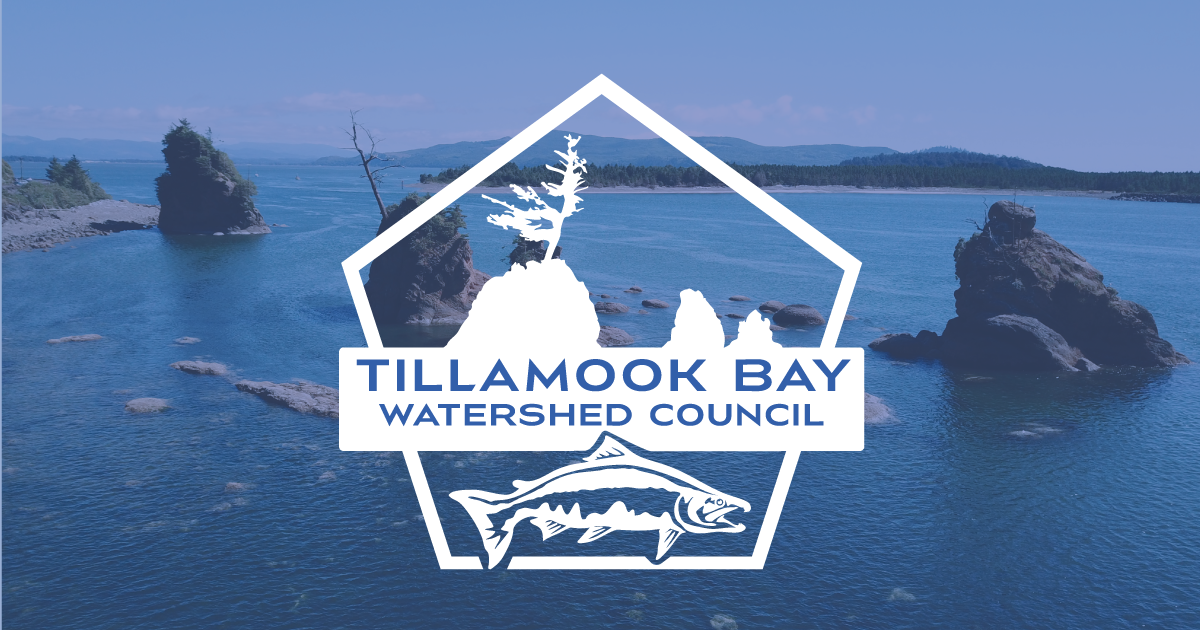
This isn’t just a logo—it’s a visual story. At the center swims a
Coho salmon, representing the heartbeat of the watershed. Encircling it are the
five rivers—Tillamook, Trask, Wilson, Kilchis, and Miami—that flow into the bay and sustain its life.
The
haystack rock and tree silhouette in the background is a local icon, grounding the logo in the familiar landscape of our coastal region. It’s a nod to place, heritage, and the people who care for this environment every day.
Design and Development with Purpose
Creating the landing page was no small task. It needed to be clear, engaging, and easy to navigate, especially for a community nonprofit. We designed and built it to serve as both a welcoming introduction and a practical tool—whether someone wants to volunteer, learn, or simply explore the watershed.
🔗 Visit the new page:
www.tillamookbaywatershedcouncil.org
Just the Beginning
We’re now moving into the next phase—developing a full website and crafting a custom marketing strategy to support TBWC’s outreach and restoration efforts.
This wasn’t just a design job—it was a partnership grounded in local pride, shared values, and a vision for what’s next.

