The Short Story
Tips and Tricks and Useful Info
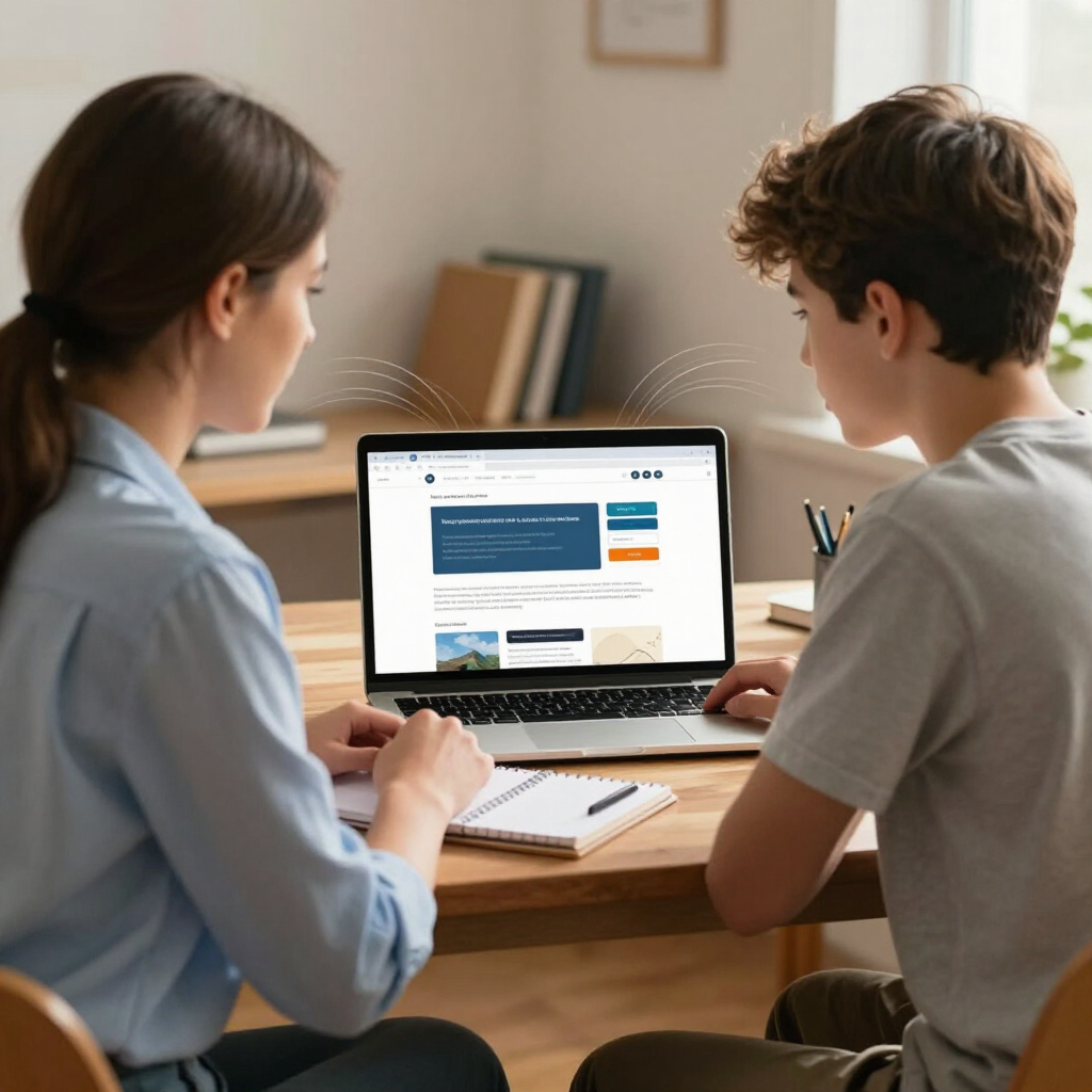
How People Read Websites Today
People Still Don't Read Websites Like Books. Here's What Has Changed.
When someone lands on your website, they are usually asking one quiet question:
Is this for me?
Your job is to help them answer yes.
Sadly, we should note this is one of the biggest mistakes we still see on websites: pages that do not help visitors quickly recognize whether they are in the right place.
A close second is ignoring how people actually read on the web.
That sounds simple, but it affects almost every part of your website. Your headings. Your homepage copy. Your buttons. Your service pages. Even the order of your paragraphs.
Years ago, Nielsen Norman Group gave website owners a finding that felt both obvious and a little rude:
People do not read web pages word for word. They scan. They move quickly through the page, looking for headings, phrases, links, buttons, and visual cues that tell them whether the page is useful.
That original NN/g research, published waaay back in 1997, found that 79% of users scanned new web pages, while only 16% read word by word.
This became one of the most repeated ideas in website strategy. It also became one of the most ignored.
We have talked about this several times before, because it matters. If your website depends on visitors patiently reading every paragraph in order, your website may be asking for more patience than most people brought with them.
Those researchers updated their nearly 30 year old findings not long ago.
The short version is this:
Websites have changed a lot. People have not changed as much as we might like to think.
What has changed since the early web?
The web in 1997 was a different place.
Pages were simpler. Phones were not the main way people browsed. Search engines were less central to how people found answers. Social media had not trained everyone to skim at Olympic speed.
Today, your visitors may arrive from Google, ChatGPT, email, Facebook, LinkedIn, a referral link, or a random tab they opened three hours ago and forgot about.
They may be on a laptop at work, on a phone in a parking lot, or on an iPad while half-watching a show.
That changes how your website needs to work.
Modern users are often more task-focused. They are not just "browsing your site." They are trying to answer a question:
- Do you help people like me?
- Can I trust you?
- What do you offer?
- How much does it cost?
- What happens next?
- Can I contact you without committing my afternoon to a form?
For small business owners, this means your website cannot act like a brochure sitting politely on a coffee table. It needs to help people move. Quickly.
For educational consultants, this matters even more. Parents and students are often overwhelmed before they land on your site. They are comparing options, trying to understand your process, and looking for signs that you are credible, calm, and clear.
A wall of text will not help them feel calmer.
What has stayed the same?
People still scan.
The same researchers say the basic behavior has held up over time. Users look for cues. They notice headings, links, lists, bold text, page structure, and words that match the task in their head.
This is not because people are lazy. It is because they are busy, cautious, and goal-focused.
Before someone gives your website their full attention, they usually do a fast check:
- Is this relevant?
- Does this look credible?
- Can I find what I need?
- Is this worth more of my time?
That first pass may last only a few seconds.
If your page gives them clear signals, they may keep going. If it does not, they may leave.
The F-pattern is still part of the story, but not the whole story
For years, website advice often focused on the F-pattern.
That is the idea that users often scan across the top of a page, move down, scan across again, then continue down the left side.
That pattern still happens, especially on text-heavy pages.
But the later research explains that online reading is more varied than one simple pattern. People may:
- Scan headings in a layer-cake pattern
- Move through a page in a zig-zag pattern, especially when the layout alternates text and images
- Spot specific words or phrases
- Skip sections that look irrelevant
- Hold their place while deciding whether to keep reading
- Commit to reading when the content clearly matches their need
That last part matters.
People will read online when the content earns their attention.
The goal is not to make every page shorter until it says almost nothing. The goal is to make the page easier to enter.
Good structure helps people decide what deserves their time.
What this means for your website
If your website serves small business owners, families, students, or other real humans with full calendars, write and design for scanning first.
That means:
- Use headings that say something useful
- Put the main point near the top
- Keep paragraphs short
- Use bullets when a list helps
- Make links specific
- Cut vague claims
- Answer common questions directly
- Break long pages into clear sections
- Do not hide important details because you think people should "call to learn more"
A heading like Our Process is fine.
A heading like A Clear 3-Step Process for Choosing the Right College List is better.
A button that says Learn More is fine.
A button that says Schedule a Free 20-Minute Call is better.
A paragraph that says, "We provide personalized solutions for your needs," could apply to almost any business on earth.
A sentence like,
"We help high school juniors build a balanced college list before application season gets stressful," gives people something specific to grab onto.
The big takeaway
Online reading has changed because the web has changed.
People have more devices, more distractions, more tabs, more choices, and less patience for unclear pages.
But the main rule still holds.
People scan first. They read later, if your page gives them a reason.
Your website does not need to shout. It does not need to be cute. It does not need to cram every detail into the first screen.
It does need to be clear.
Clear pages help the right visitors recognize themselves, trust you faster, and take the next step with less hesitation.

